Central Store Stock Management
Reimagining Central Store Stock Management
Challenging established journeys to create a faster, more accurate way for M&S colleagues to manage stock
Executive Summary
Central Store Stock Management is critical to the operation of every Marks & Spencer store. It spans multiple products used by store colleagues, distribution centres and central stock controllers to record, manage and adjust stock. Without accurate stock information, M&S cannot reliably determine what stores have, what they need, what to send them or how much stock is being sold.
When Design first became involved, the product had already existed for several years and was partway through a major modernisation programme. Most of the architecture had been established, key tasks had already been defined and implementation had begun. With no dedicated designers available when the programme started, Product Managers had been forced to make UX decisions themselves.
Design was initially brought in to improve the UI.
I deliberately challenged that brief.
Rather than simply making existing screens look better, I immersed myself in stores, experienced the stock processes first-hand and used that understanding to challenge the journeys that had already been defined. By creating viable alternatives, prototyping them on the same devices colleagues used and validating them in their real working environment, we demonstrated the value Design could bring beyond visual execution.
That changed the relationship between Design and Product.
Within a short period, we moved from being brought in at the end of established tasks to being involved at the earliest stages of conception, helping shape journeys before they were formalised, validating assumptions and influencing the direction of the product.
Entering a Product Already in Motion
The modernisation programme had a clear business objective: create a better digital experience for managing stock.
The problem was that the product decisions had largely already been made.
The architecture had been established. Access to different counting tasks had been determined. Some designs had already been created and development had begun.
This wasn't because the Product team didn't value user experience. There simply hadn't been designers available to support them.
When our team arrived, the expectation was therefore relatively straightforward:
Make the existing screens look better.
I didn't believe that was where we could add the most value.
The product supported an essential operational process, but the existing journeys had been defined largely from a business and technical perspective. The opportunity was to understand what actually happened when colleagues performed these tasks and use that knowledge to challenge whether the digital experience reflected the physical reality.
That meant going into stores.
Starting With the Physical Task
Stock management is not an abstract digital problem.
A colleague is physically moving around a store, locating products, scanning them, recording quantities and making decisions about what should or shouldn't be included. The digital product is simply the tool supporting that activity.
I needed to understand the task before I could meaningfully redesign the product.
Over the course of a week, a researcher and I worked five different shifts across stores, covering early, standard and late working patterns. We interviewed and shadowed three to four colleagues during each shift and, crucially, performed the tasks ourselves.
We scanned flowers and plants.
We completed a domino count.
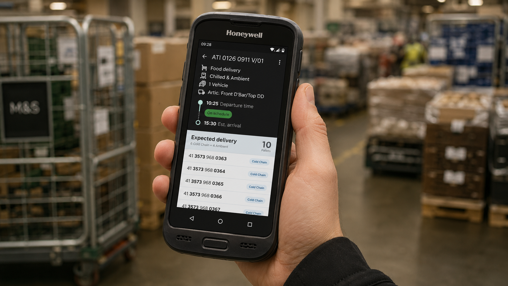
We experienced the Honeywell devices in the same environment and conditions as the colleagues using them every day.
This immersion revealed problems that weren't apparent from the existing product requirements.
Colleagues had developed their own ways of working around the limitations of the products. Acronyms were commonplace but often poorly understood. Knowledge about how to complete tasks was frequently passed from colleague to colleague rather than being communicated through a central source.
The biggest insight was that colleagues had become extremely good at adapting to imperfect experiences.
That didn't mean those experiences were working well.
Challenging the Established Journey
Our first opportunities were two counting tasks: Flowers & Plants and Domino Counts.
The existing process for scanning products and recording quantities was unnecessarily long and awkward.
More importantly, there was an unresolved tension between accuracy and efficiency.
One proposed approach was to scan every individual product. This could improve accuracy, but required colleagues to repeatedly move around the store, scanning the same products in different locations before returning to where they started.
The alternative was to scan products by location.
This was significantly faster, but introduced a greater potential for inaccurate counts.
Rather than deciding which approach was theoretically correct, we reframed the problem.
What level of inaccuracy was actually acceptable?
We proposed both approaches, tested them with colleagues and worked with stakeholders to establish an acceptable tolerance.
That gave us the evidence to support a more efficient approach: colleagues could scan all relevant products within an area before moving to the next location, rather than repeatedly walking around the store.
It was a relatively simple design decision.
But it demonstrated something much more important.
Design could challenge the established product direction with evidence, rather than simply execute the requirements we had been given.
Designing With the Visual Language
The emerging colleague visual language provided an important foundation for these decisions.
Two principles were particularly influential:
Function over form.
User-centric, colleague-approved.
The experience needed to make the next action obvious, minimise unnecessary steps and ensure the information presented on screen reflected the physical reality in front of the colleague.
The design system was also beginning to emerge from this work.
The patterns we were establishing through these initial journeys were not only solving problems within Stock Management; they were helping determine which patterns could eventually become reusable components across the wider colleague product estate.
The product therefore became both a customer-facing solution and a testing ground for the wider design strategy.
Discovering the Complexity Behind "Simple" Tasks
One of the most valuable outcomes of the research was discovering how much contextual knowledge colleagues were expected to carry themselves.
Flowers & Plants provided a particularly revealing example.
When asked what should be included in a stock count, colleagues were confident they knew the answer.
But when we questioned whether items on a nearby stand—such as seeds and potted plants—should be included, the answer was no.
We tested it.
The system accepted those products.
They should have been counted.
This revealed that colleagues had potentially been writing off significant amounts of stock incorrectly for years because the digital experience hadn't made the rules clear.
The problem wasn't that colleagues weren't capable of doing the job.
The problem was that the product assumed knowledge that wasn't consistently there.
That changed our approach.
Contextual guidance and clear signposting became fundamental parts of the experience, alongside the simplest possible route through the task.
From Late-Stage UI Support to Product Strategy
The most significant transformation happened after these first pieces of work.
Initially, Design was brought into the process once the task had largely been defined.
We had to earn the right to influence more.
We did that through evidence.
Rather than telling Product that their journeys could be better, we demonstrated viable alternatives, tested them with colleagues and brought the results back into the team.
The response changed quickly.
Product Managers who had initially been sceptical—many of whom had previous experience working in stores themselves—began involving us earlier.
Meetings that had previously been largely directive became collaborative.
Business priorities continued to determine which operational problems needed solving, but the way those problems were approached became much more fluid.
We could begin exploring a task before the journey had been formalised, while Engineering investigated technical feasibility in parallel.
That created a new model:
Product brought the business problem.
Engineering brought the technical constraints.
Design and Research brought the user's reality.
Together, we worked towards the most practical outcome.
Taking Discovery Beyond the Store
That approach became particularly valuable when we began exploring delivery acceptance.
Initially, we investigated what happened when a store received a delivery.
It quickly became clear that understanding the store side alone wasn't enough.
I found contacts who could give me access to a distribution centre and spent time understanding how deliveries were assembled and dispatched to stores.
That knowledge changed the product.
We could introduce context that colleagues had previously lacked, helping them understand how their delivery related to what had been prepared at the depot.
It also exposed edge cases that were rarely encountered but potentially critical.
Damaged stock.
Products exposed to incorrect temperatures.
Pests.
Items that could no longer safely be sold.
Store colleagues and managers we spoke to often had little understanding of what they were expected to do when these situations occurred because they happened so infrequently.
The product therefore needed to do more than process a delivery.
It needed to help colleagues understand what to do when the normal process broke down.
Designing in the Real Environment
Once a journey had been agreed, we created high-fidelity prototypes that ran on the same Honeywell devices used by colleagues in stores.
We didn't simply show screenshots in a usability session.
We gave colleagues the device and recreated the task in their working environment.
This exposed issues that would have been easy to miss in a traditional desktop-based design review.
The physical environment mattered.
The movement around the store mattered.
The distinction between counting individual products, trays of products and loose-weight items mattered.
The information required to distinguish one product from another mattered.
Every iteration therefore became a negotiation between accuracy, efficiency, physical behaviour and digital interaction.
One example was the decision to accept a controlled level of inaccuracy in exchange for significantly reducing the physical effort required to complete a count.
That decision could only be made confidently because we had observed the task, understood the business tolerance and tested the alternatives with the people performing it.
Changing the Role of Design
The product became a proving ground for a different way of working.
Design was no longer the team asked to make completed requirements look better.
We became involved before the journey existed.
Product Managers began bringing us into early discussions about what should be built next.
Engineering became involved during discovery, helping us understand technical constraints while also being exposed to concepts that challenged those constraints.
Research became part of product development rather than a final validation step.
Most importantly, Design gained credibility across a Digital & Technology organisation where it had previously been underutilised.
The work became something the wider company could see and talk about.
Central Store Stock Management became a flagship example of what could happen when design was involved early enough to influence the problem, rather than late enough to influence only the interface.
Outcomes
For colleagues
The experience became clearer, more contextual and more efficient.
Colleagues better understood why they were being asked to perform particular tasks, what information they needed and what action to take next.
Time spent completing tasks decreased, providing an early indication that the efficiency gains we were targeting were being realised.
For Product
A product that had initially been defined primarily around business requirements became a flagship example of colleague-centred product development.
The team gained a repeatable approach for exploring and validating journeys before committing them to development.
For Design
Design moved upstream.
The team gained credibility and influence, with Product Managers increasingly involving Design during early conception rather than after requirements had already been established.
For the wider organisation
The project helped establish a new expectation for how colleague products should be designed: start with the physical reality of the task, understand the colleague performing it, challenge assumptions and validate the experience before building.
That approach subsequently influenced how other product teams worked.
Reflection
The biggest problem wasn't the UI.
It was the underlying journey.
The real opportunity came from leaving the desk and experiencing the physical task first-hand.
That changed the quality of the decisions we could make.
My most important decision was simply not to accept the status quo. We had been brought in too late to make significant strategic changes to the initial tasks, but rather than accepting that limitation, we created alternatives that were good enough to challenge the established direction and proved them with the people actually using the product.
That created trust.
And trust created influence.
The lasting impact of the project isn't a particular screen or interaction. It is the approach it established: Design should be involved early enough to shape strategy, not simply late enough to improve execution.
For me, that remains one of the clearest lessons in product leadership:
Leadership doesn't always come with ownership of the roadmap. Sometimes it comes from recognising the opportunity to make the roadmap better—and having the evidence and conviction to act on it.