Colleague Visual Language
Changing How M&S Designs Digital Products
Establishing a shared product language across 100+ colleague products
Executive Summary
When I joined Marks & Spencer, the business had invested heavily in building product teams to solve operational challenges across the organisation. The result was a rapidly growing portfolio of more than 100 colleague-facing products, each designed independently, with inconsistent user experiences, duplicated interaction patterns and no shared understanding of what a great colleague experience should look like.
Rather than viewing this as simply a design consistency problem, I recognised a broader organisational challenge. Design, Product and Engineering lacked a common language for discussing and creating experiences. Without that foundation, every new product risked increasing complexity for the 50,000+ colleagues relying on these tools every day.
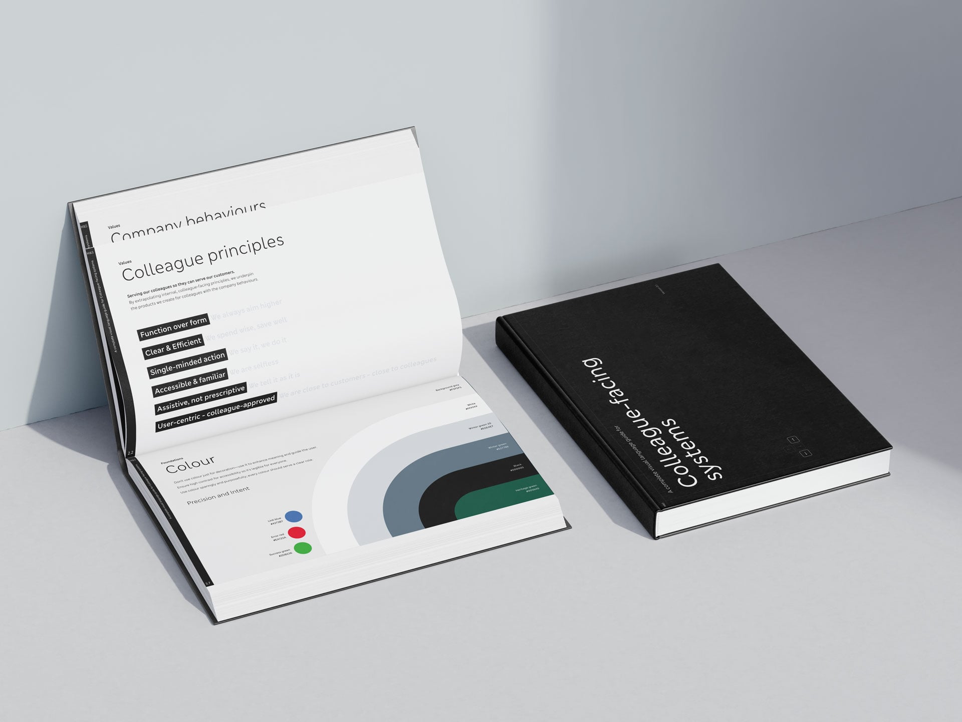
I led the creation of M&S's colleague visual language—a strategic framework that established the principles, foundations and design philosophy for every future colleague product. More than a style guide, it became the catalyst for changing how teams approached product design, encouraging earlier collaboration, greater user focus and a consistent experience across the organisation.
Explore the Visual Language Guidelines
The Challenge
When I arrived, the colleague product organisation was still in its infancy. Product teams had been established to address specific business needs, but very little investment had been made in user experience or product design. Every team interpreted problems differently, resulting in dozens of disconnected experiences across a wide range of devices.
Although M&S already had a customer-facing design system, it quickly became apparent that it wasn't designed for the complexity of colleague tools. Store colleagues regularly move between multiple applications during a shift, often performing similar tasks in entirely different ways. Each transition introduced additional cognitive load, longer learning curves and unnecessary friction.
The business initially viewed this as a consistency issue. Through spending time with colleagues in stores, I realised it was much bigger than that.
Starting With People, Not Components
Before considering colours, typography or components, I immersed myself in the environments where these products were actually used.
I spent my first weeks working alongside colleagues in stores, observing how they completed everyday tasks, moving between applications with completely different navigation models, terminology and interaction patterns. Rather than interviewing users from behind a screen, I experienced the products in the same environment they used them.
One theme emerged repeatedly.
Colleagues weren't struggling because individual products were poorly designed. They struggled because every product expected them to think differently.
Someone counting stock shouldn't have to relearn navigation simply because they're using another internal application.
That insight fundamentally changed the direction of the project.
The challenge wasn't creating better interfaces.
It was creating familiarity.
Success became simple to define:
Regardless of which product a colleague opens, it should feel familiar, feel unmistakably like M&S and allow both experienced and new colleagues to understand how to complete their tasks with confidence.
Building a Shared Vision
Creating another design system would not solve the underlying problem.
Instead, I proposed creating a colleague visual language first—a shared philosophy that defined what great colleague experiences should feel like before deciding how they should look.
Separating the visual language from the design system was a deliberate decision.
The visual language answered questions such as:
What principles should guide every product?
What experience should colleagues expect?
How should teams make design decisions?
Only once those foundations were established would a reusable design system be created to help teams implement them consistently.
This shifted conversations away from components and towards outcomes.
The emphasis became function over form, designing specifically for colleagues rather than adapting customer experiences, and ensuring every design decision could be justified through real user needs.
Creating Organisational Alignment
Introducing a new way of designing products required far more than producing guidance.
It meant changing how Product, Design and Engineering worked together.
The first challenge was gaining support from our Head of Product Design by demonstrating why the existing customer design language could never fully meet the needs of colleague products.
Once aligned, I worked with Heads of Product across multiple business domains, introducing the visual language through live projects rather than presentations.
Rather than asking teams to trust a document, I helped them apply the principles to products already in development and then returned to stores together to observe the results.
This became the turning point.
Watching Product Managers stand alongside colleagues as they interacted with prototypes using the new visual language changed the conversation completely. They saw colleagues navigate products more confidently, ask fewer questions and complete tasks more naturally.
From that point onwards, discussions shifted from:
"Why do we need this?"
to:
"How quickly can we adopt it?"
The biggest change wasn't the interfaces.
It was behaviour.
Product Managers began involving Design much earlier in discovery.
Design became part of defining problems rather than decorating solutions.
Leadership began recognising the value of consistent colleague experiences.
Engineering gained a clearer understanding of where products were heading, even before the design system existed.
Designing for Scale
The visual language deliberately avoided prescribing every interaction.
Instead, it established the foundations teams needed to make better product decisions independently.
Where existing patterns already worked well, we standardised them rather than reinventing them.
For example, if colleagues had already become familiar with completing stock-related tasks using a particular interaction pattern, that pattern should become the default across every product performing similar work.
One significant strategic decision was to build upon Google's Material Design as the underlying interaction model.
This balanced several competing priorities.
It provided Engineering with a familiar implementation approach, aligned naturally with the Android devices used across stores and allowed us to focus our effort on creating experiences that felt distinctly M&S rather than rebuilding mature interaction patterns from scratch.
Accessibility was embedded throughout the work rather than treated as a separate consideration, drawing upon previous experience delivering highly accessible products and collaborating closely with accessibility specialists within the design team.
Creating Momentum
The visual language wasn't introduced through mandates.
It earned credibility through delivery.
Each successful implementation created another example teams could reference, gradually increasing confidence across Product, Design and Engineering.
Supporting material extended beyond the guidance itself.
I created documentation explaining why the visual language existed, the principles underpinning it, ten foundational design considerations and practical guidance to help teams determine whether new work aligned with the intended direction.
Those materials became the basis for presentations delivered across the organisation, ranging from individual product teams through to audiences of over 500 colleagues.
The objective wasn't simply adoption.
It was creating shared understanding.
Lasting Impact
The most important outcome wasn't a document.
It was changing how products are created.
Today, product teams adopting the visual language involve Design earlier in the process, designers share a common rationale for their decisions and Engineering has clearer guidance supporting implementation.
The initiative also played a significant role in raising the profile and influence of the colleague design team across Marks & Spencer.
While the design system has since become the next stage of this journey, the visual language established the strategic foundations that made it possible.
If I were to leave tomorrow, those foundations would continue guiding how colleague experiences evolve because the organisation now has a shared understanding of what good looks like.
Reflection
Looking back, I don't consider this project successful because it standardised interfaces.
I consider it successful because it changed how an organisation thinks about product design.
The visual language gave Design, Product and Engineering a common vocabulary for discussing user experience and created the conditions for consistent, scalable product development long before reusable components existed.
My biggest contribution wasn't creating the guidelines themselves.
It was recognising that the organisation didn't need another design system—it needed a shared product philosophy capable of shaping every future colleague experience.